Some of my feedback from David was to re-think some of the typeface choices thatch had made, but after doing a few experiments with what I wanted and I really struggled to narrow it all down therefore I had a Skype tutorial with him and we spoke through the idea of meeting narrowing down my four typefaces.
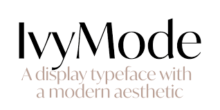
We managed to take it down to my display typeface; Ivy Mode
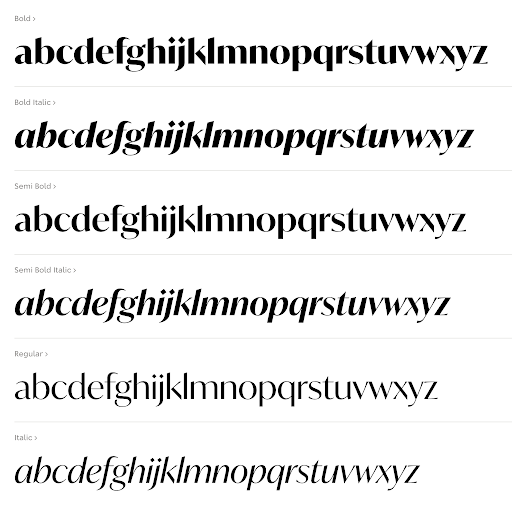
and my body text; Avant Garde
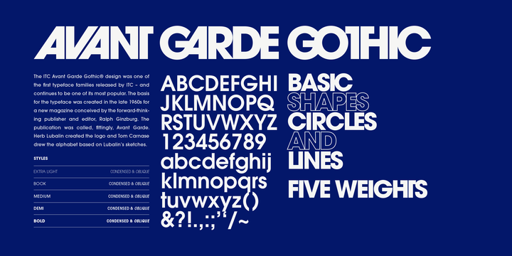
Both of these typefaces work well together and as David pointed out I don’t need to have a third typeface that would act as a ‘stereotype’ this is down to the fact that with a light weight of Avant Garde alongside the colour scheme it could definitely be portrayed as a “feminine” typeface. I had a quick look at some designs that had already been done with Avant Garde and I really think it gives me room to playground a bit more.


After looking at a few of these and having a few different designs I changed within some aspects the design document I have some up with a new way to display some of the messages that I have.


 I liked the idea of having “subliminal messages” but David suggested me to get rid of the typeface that I had already used in the document and test some others. I have has a new way of playing around with the subliminal messages shown and I have used a Light weighted Avant Garde typeface and I have used the two different colours and places around with repetition and opacity in order to create a messy/ more subliminal approach.
My examples;
